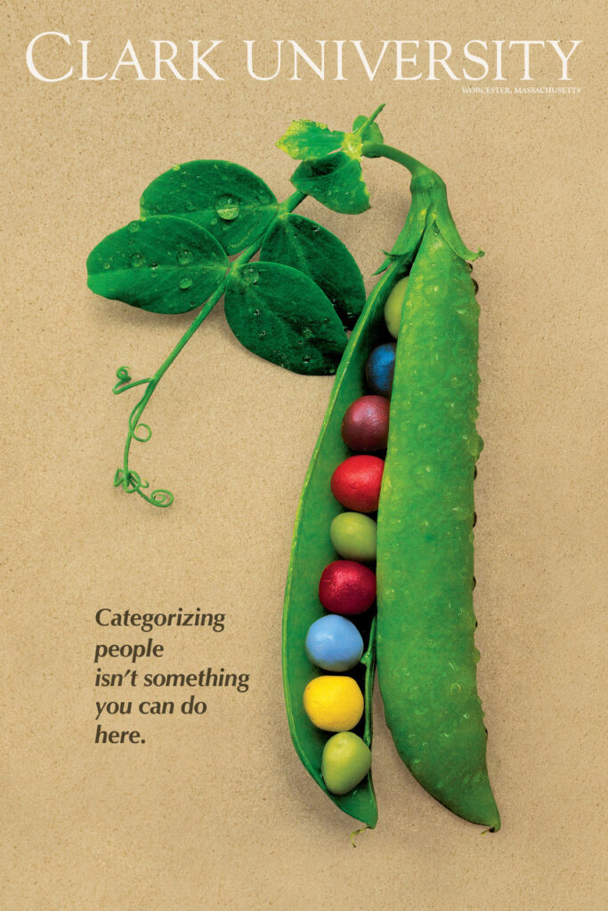
On a hot August Day in the early 1980s, designer Keith Carville and photographer Chuck Kidd drove to a vegetable farm in Hubbardston, Mass., painted some peas, and snapped a picture. The resulting poster of vibrantly colored peas nestled inside a pod, paired with the tagline, “Clark University: Categorizing people isn’t something you can do here,” resonated with students and alumni, who appreciated the message that Clark is a community of individuals — all are different, and all are welcome.
The pea pod poster was unveiled on August 14, 1982, and quickly began appearing in dorm rooms across campus, and found its way onto the office walls of high school guidance counselors. The meaning behind the multi-colored fruit (yes, peas are fruit) struck such a deep chord that the poster remains displayed on some of those same walls, many years after the pea pod was decommissioned.
“The poster may be old and tattered, but the guidance counselors don’t want to replace it,” says Terry Malone ’01, MSPC ’09, director of admissions at Clark. “They understand the importance of the message, and their students do, too.”
“It’s still one of my favorite things about Clark,” says Tad Overbaugh ’93. “After dealing with all the cliques in high school, this was really refreshing. It set the groundwork of respect for all the different kinds of people you might come across here.”
For Cate Whitfield ’92, the pea pod reinforces Clark as a place “free from judgment.”
“That’s so important, especially for young adults on their own for the first time.”
In an essay published by Clark some years ago, Hank Fradella ’90 captured why the pea pod endures.
“I was hard to categorize in high school, as I didn’t really fit the mold of being a ‘jock,’ or a ‘prep,’ or drama/music ‘geek’ — even though I was a little of all of them,” Fradella wrote. “The pea pod poster was not propaganda. It was truth. Nearly everyone I knew at Clark ‘fit in’ because there weren’t any predefined molds to which we had to adhere.”
The pea pod process
Carville was working at Clark in 1984 when Annette Kahn, director of communications, asked him to design a poster with multicolored peas inside a pod — an image already existing as a watercolor illustration. “Chuck Kidd knew a guy with a farm in Hubbardston, so we went in search of the perfect pea pod,” Carville recalls.
The duo engineered “perfection” by positioning the curly stem of one pea pod atop the body of another. Carville left two green peas in the pod, removed the rest, and fashioned seven new peas out of putty. He spray-painted the peas different colors, then gingerly placed them inside the pod. Once the peas were in place, he misted the pod with water and laid it on a sheet of sandy-colored paper. Kidd took his photos — and a Clark symbol was born.